Thikra Blog shares smart living tips, home gadget updates, and lifestyle technology insights tailored for UAE readers.
Android is full of hidden features and settings that most people never touch, and some of them can change the way you use your phone. One such setting that completely blew me away was forcing my phone into a tablet-style UI. When I first tried it, I thought it’d be gimmicky at best. But that wasn’t the case.
This mode made menus wider, apps feel roomier, and multitasking a breeze. I could see more content at once and move around apps more naturally. And with modern Android phone screens now being bigger than ever before, this smaller, denser UI makes so much sense that I’m not planning to go back to the default layout anytime soon.
Enabling tablet-like UI on my phone was easy
One setting is all it took


Android’s Developer Options menu comes packed with some useful settings. It almost feels like a place you’re not supposed to touch unless you know exactly what you’re doing. But among all these scary-sounding toggles are options that are fun to play with.
While poking around the Developer Options menu on my phone, I came across the Minimum width or Smallest width option. At first, it feels like developer jargon, but it’s really a DPI setting that simply tells Android how to scale the screen. By default, Android phones keep this number low so apps scale for single-hand use. Tablets push it much higher, which tells Android to lay out apps differently.
Once you’ve enabled the Developer Options menu on your phone, search for the Minimum width option. On my phone, it was set to 360 default, but it may be different for you depending on screen size and resolution. Make sure to note this number. You’ll need it to switch back to the original layout.
Now comes the fun part. Increasing this number makes everything appear smaller than default. Text gets more compact, more content fits on the screen, and once you push past a certain point, your phone switches to a tablet-style layout. Decreasing the number does the opposite.
The best part is that you can experiment freely. Enter a number and your phone instantly adapts to that DPI. Just make sure you don’t go wild with it. Entering an extreme value can make the interface difficult, or even impossible, to use.
Apps feel way better in this mode
See more at glance
The biggest benefit of switching to a tablet-style UI was how much better my apps felt. I expected things to look smaller and difficult, but the tablet-like UI somehow made apps feel more spacious, and easier to interact with.
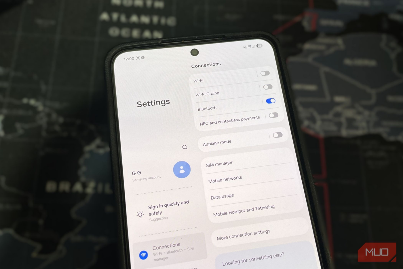
The Settings screen shows a side-by-side view, with categories on the left, and the actual settings on the right. This made it easier to move around, and I was also able to see more options at a glance without scrolling too much.
That same layout improvement carried over to other apps too. My Files app on my Galaxy phone made sense, with folders and file previews visible at the same time. Messages benefited from the wider layout as well, showing conversations on one side and the chat thread on the other. Even apps like Calendar felt noticeably better to use.
One of the biggest upgrades though, was in web browsing. This mode made Chrome switch to a PC-like interface, with tabs appearing on the top and sites loading in desktop mode by default. On some Android phones, this mode also brings the tablet-style taskbar at the bottom. This makes switching between apps much faster.

Your Android home screen will feel brand-new after you try this launcher
With this launcher, my phone is new again.
A few adjustments can make it perfect
Fine-tuning made all the difference


The tablet-style UI looks good from the moment you enable it, but a couple of small tweaks can make it even better. The first thing I changed was the home screen grid. With everything scaled down, the default grid suddenly felt too sparse. Increasing the number of columns and rows made it feel just right.
Next, I noticed the text felt too small in some places, so I increased the font size slightly to make everything readable without having to squint my eyes. These are just a couple of examples, but you can do more if you plan to stick with the tablet-style UI for some time. For instance, redesigning the Quick Settings panel and resizing widgets can make this mode look even better.
It’s not perfect…
As much as I enjoy using my phone in tablet-style UI, it’s not a flawless experience. The biggest drawback is that not every app adapts to this layout well.
Except for the built-in apps and a handful of well-optimized ones like Chrome and Instagram, most of the apps simply scale everything down. This makes buttons harder to tap, and you also miss out on the benefits you get from tablet-optimized layouts, like the split views you get in apps such as Messages, Calendar, and Chrome.
Screen size also matters a lot. On larger phones, the tablet-style UI feels natural and comfortable. On a smaller phone though, it can feel like too much of a compromise. Everything becomes smaller, touch targets are harder to hit, and longer sessions can start to feel tiring.
source
Note: All product names, brands, and references in this post belong to their respective owners.
For more smart home guides, lifestyle tech updates, and UAE-focused recommendations, visit blog.thikra.co.
To shop smart gadgets, accessories, and lifestyle electronics, explore Thikra Store at thikra.co.


Leave a Comment